
Discover more from Fabricated Knowledge
Either I am reading the wrong things — or I have never really heard it discussed — but dollar revenue growth analysis is a relatively elegant way to understand s-curves and earnestly frame revenue growth. I don’t see it discussed often if ever, and I have been starting to use it a lot personally when modeling out companies.
First off — I want to say that this post is definitely inspired, as all things are online, by the stuff I’ve read before — and 2 pieces in particular come to mind. First this piece on s-curves at lesswrong.com by mr-hire and second this piece by Eugene Wei.
Also while I’m at it, disclaimer time: nothing is investment advice, nor do I have any idea what I’m doing, this is an anon blog and you should take everything accordingly for someone who won’t put the skin in the game of my real name. I truly hope you’re beyond taking advice from strangers on the internet.
So, if you haven’t figured it out by now, but S-Curves are notoriously hard to predict. Maybe its non-linear thinking, or the human’s inability to understand exponential growth, or hyperbolic discounting, or whatever. All I know is that it’s clear that S-curves are hard to predict.
I was raised on Valuation by Damodaran, and if I recall correctly you’re supposed to decelerate growth to the industry growth rate in the end terminal period as a kind of best practice in a typical model. You see it all the time in models of others, consensus revenue estimates, etc. A kind of double discounting on the growth rate beyond your discount rate itself. And for the most part this makes sense in linear growth companies, but S-curves… are well s-curves! Looking at the base rate book and you’ll see that the previous revenue deceleration assumption is right on average, but obviously s-curves have this weird power that when they inflect over a certain adoption percentage they accelerate — or stay flat as a percentage of revenue. Imagine with a straight face suggesting that a company will accelerate to your boss, when all you’ve ever been taught is mean reversion to the dust. Pretty hard if you ask me!
This is from the Less Wrong piece
This is where dollar revenue growth really shines from an analysis perspective. Now be forewarned, there are no silver bullets, just another framing tool and constant pruning of the bookends of your expectations. And from a high-level dollar revenue is pretty much stolen from this chart, except graphing the dollar revenue to match what you see here.
Also from the less wrong piece
So let’s see it in action with one of the most famous S-Curves ever, Apple.
Apple — Over the S-Curve Hill
The second “hill” was the larger format size, an expansion of their TAM.
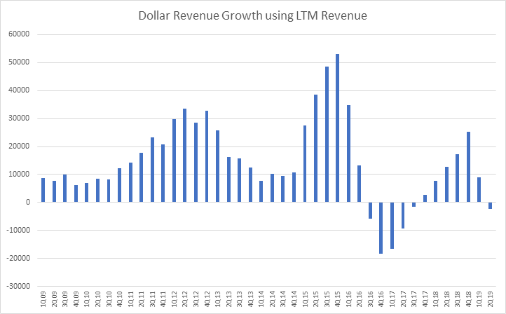
Not quite as clean as the graphic huh? And not to mention we had some significant decelerations or even dollar shrinkage for Apple multiple times. If you think about the historic stock prices for Apple and stock narrative scares, this really helps put the multiple contract and deceleration fears in context (below).
The multiples are just contractions due to fear of deceleration. Well I can hear you say “duh mule — you can just tell that by a lowering of sales growth percentage — this is the dumbest analysis ever and pretty much showcases your lack of understanding for calculus.” — but just wait! I think this helps give nuance to what’s so different about the 2016 bear case on Apple than the 2013 bear case on Apple.
In 2013 the company was still growing and decelerating, meaning its over the hill but I would feel much more comfortable with that chart than the 2016 deceleration, just because it was still positive. Meanwhile in 2016 I can feel very confident we are over the S-curve hill for iPhones, and there is no way else to cut it. We may see dollar revenue go positive or negative in the future, but that really is a function of the replacement cycle.
And I think that’s okay! The current bull case is now predicated on Apple services, another huge growth story in it’s own right.
(There’s a 1 time charge of 640 in 4Q17 — but the dollar revenue deceleration is something to be a bit wary of.)
And while this is all very transparent in the ever-high-profile Apple, you can make inferences similar to this but on much less covered companies using Dollar revenue curves. Also feel free to do calculus on something as noisy as quarterly results — this is just how I do things and think its much easier to understand.
But likely the problem on this analysis here is that iPhone now have hardware cycles, as they have become durable products. So where this really seems to be the best framework is for companies with consistent annual revenue and no replacement cycles growing through secular s-curve adoption… which reluctantly brings me to an analysis on everyone’s favorite topic as of late, Software as a Service.
I think where this tool is best used is probably in consumable viral products, and recurring revenue subscriptions. The product has to be bought each year with a short life span, so maybe Spin Master(TOY:CN) is probably a good example for viral product adoption cycles — and the dollar revenue chart sure tells a story. Reminder Spin Master made the viral hit Hatchimals.
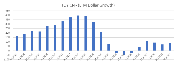
Talk about a vicious deceleration — Forward numbers are IEBS consensus
Salesforce.com and S-Curves
So, let’s change the subject to the grand-daddiest of all SaaS companies — Salesforce.com. I think the dollar based revenue assumption really shines best here. First let’s look at overall dollar revenue. Disclosure again: the model isn’t mine I am shamelessly stealing from a sell-side model here — and I don’t really know CRM past the cursory glance. The point of this post will be to look at a company I know almost nothing about, and see if the dollar revenue growth tells a story.
Let’s first take a look at total revenue dollar growth

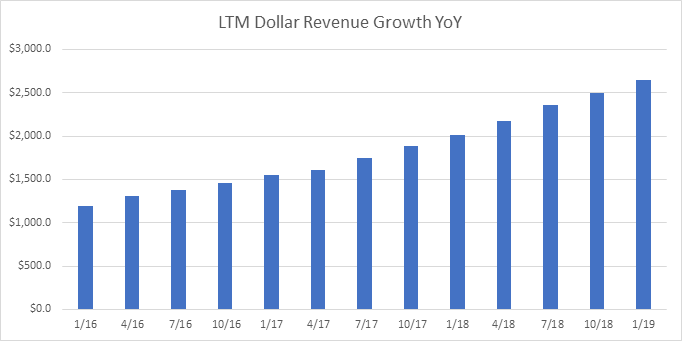
Up and to the right eh? What does this say if we refer to that S-Curve chart?

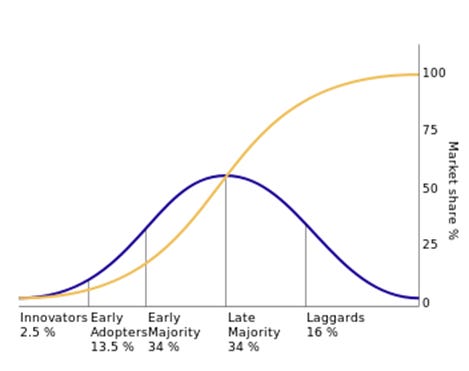
Oh wow — they aren’t even over the hill!? Now I don’t know if this is really true — but I think that by segment level tells another more interesting story. Let’s look at dollar revenue by segment.

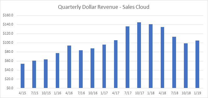

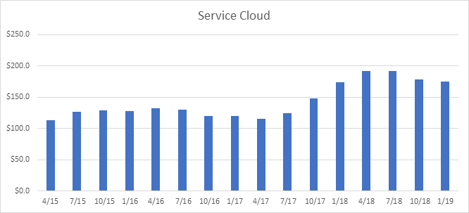

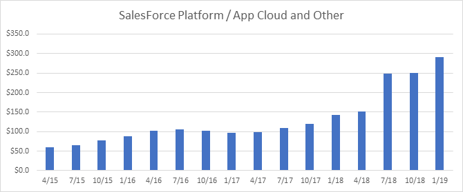

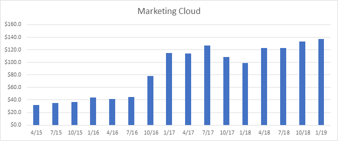
So now things really change in perspective. We can make some broad generalizations that may or may not be right, just based on the numbers without much context.
Some helpful context is that Salesforce acquired Mulesoft in 2018 and consolidated it with Sales force platform (App cloud), and they acquired Datorama in late 2018 and consolidated it with marketing, and they also acquired Demandware in early 2017 and I presume consolidated it in marketing cloud.
1) the core sales cloud is past it’s prime, there is no doubt. Revenue will still grow, but your estimates should complete that dollar revenue hump to some reasonable extent, unless you believe they can reaccelerate with something new. I find in reality the late laggards are much slower than the early adopters, and the right side of the curve is right skew.
2) Meanwhile Service cloud’s dollar revenue growth shows a business that seems either past its core s-curve adoption, a series of acquisitions, or had hit some invisible asymptote and moved past it as of late. There’s a lot to unpack there — this warrants a further look.
3) App cloud looks like an acquisition (significant jump) — if you can unpack the revenue from acquisition you can confirm / disconfirm their revenue growth expansion ability.
4) Marketing cloud looks like 2 acquisitions — and a period in between the acquisition with lower dollar growth — I would truly doubt the ability to grow in a positive dollar way into the future, expecting deceleration seems warranted.
I don’t know if any of those opinions are right, but I do think that the dollar revenue framework does give a lot more nuance than the chart below.

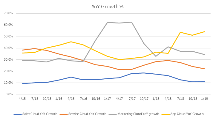
Anyways — I hope that helps prove out how to think about dollar revenue growth, and its use to help better frame the revenue perspective going forward. And let’s kind of flush it out for forward quarterly revenue expectations

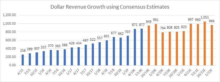
Yeah I have no idea what to tell you about that chart — other than 2020 numbers are really freaking weird and seem wrong. I would guess because it’s a hard-coded step down to ~20% revenue growth, but in the context of dollar revenue this doesn’t jive with reality. The unfortunate reality is that consensus estimates past the quarters for the rest of the year are kind of numbers they throw at the wall, and the most accurate and thought about numbers in consensus is the rest of the year based on guidance. Oh well.
Another Benefit of Dollar Revenue Analyses — Dollar Market Share
Like the rest of the investment community, I too have been shocked by the absolute staggering growth of Amazon Web Services & public cloud in general. I often hear arguments like “well Azure is growing much faster, they will catch-up” and logically a company growing 80%+ YoY makes it seem like the lead isn’t that far away, but this is where Dollar Revenue Share comes into play as well as a better framing tool.
Disclaimer: Most of the data is from Goldman estimates, I know they are precisely wrong, but probably generally correct.
First their Dollar Revenue Growth Charts — GCP sadly is not even close to broken out enough, and Azure’s revenue estimate is dubious to say the least, but I’m piggybacking on the analysts at Goldman’s work, which I think is a fair estimate.

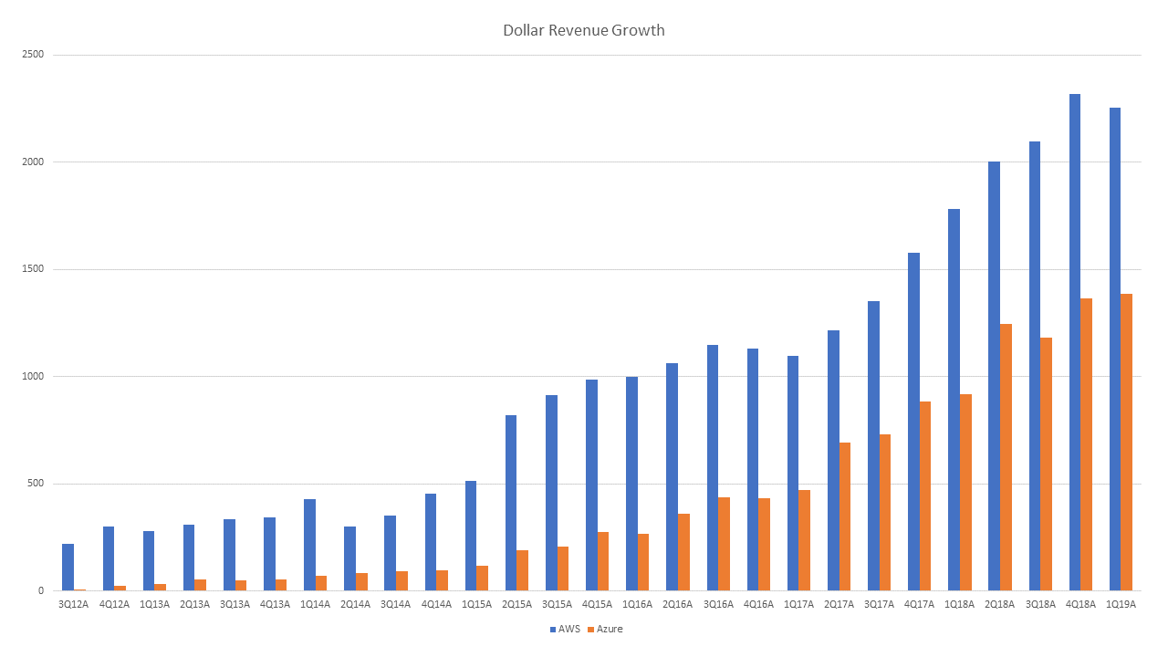
First I can understand the excitement — this is a classic and beautiful S-Curve chart here, and the higher bars helps put the excitement in context, the whole ecosystem is still not close to penetrated. Are we 10 or 40% there? I don’t know, but clearly, we are below 50% penetration. I also wonder what made cloud dip slightly in the ~3Q16–1Q17 period, and this is probably a useful thread to explore.
Next the thing that helps this frame is market share win each quarter. If you hypothetically added all the incremental dollar revenue growth charts of every cloud player, you would have how much the TAM grew that quarter. The share of that each quarter shows their relative market share wins or losses. What is really impressive here is that Azure’s catch-up is no slouch (if you believe the numbers, please disclose more MSFT), Azure went from growing ~20% as much dollar wise compared to Amazon, to 60% of the dollar revenue growth. I believe that is way more impressive than the YoY revenue growth chart below, which has some bonkers absolute revenue growth numbers, but doesn’t put the 16 to 18 catch-up in much context.

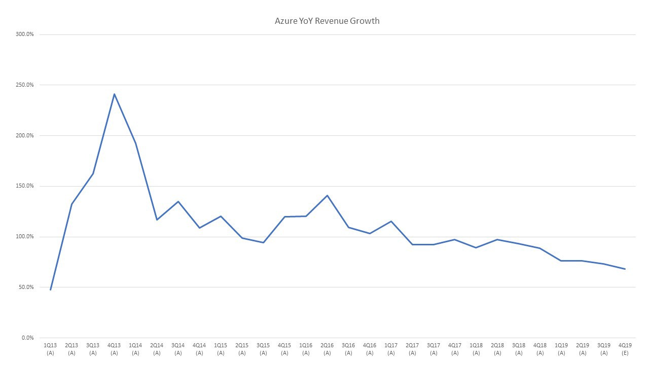
Additionally something that would be astounding would be if Azure ever grew more dollar wise in a quarter than Amazon, I would say that is the ultimate winner’s mark. If that were to happen (I’m not betting on it) — I would say AWS “lost” the cloud wars. Meanwhile using GCP’s poorly estimated annual numbers, here is the annual dollar revenue growth from GCP/Azure/AWS.

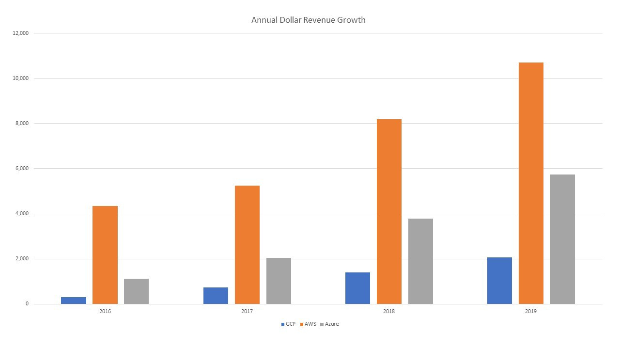
It really puts things into perspective — and for 2019 — the dollar share gains were 11%, 58%, and 31% for GCP, AWS, and Azure. Probably the correct way to think about market share gains for cloud.
Now being honest, this is an implied number at best, but is a better context generator than some large YoY revenue growth number compared against each other. Another useful way to think about dollar revenue versus just outright percentage revenue growth figures.
The Final Benefit of Dollar Revenue Growth — Thinking like the Management Team
Okay I think I got it out my system how I use dollar revenue as a kind of revenue framing metric — and this probably can be ported over to the very similar gross profit dollars that management often thinks about. Something that is also uncanny about this is that whenever I talk with a management team, I will say well do you think you’re going to grow X%, and they are like well yeah 100 million dollars in revenue growth.
I think this is a subtle but important part of dollar revenue as a framework, the shift from thinking of businesses in a spreadsheet, versus thinking of businesses as well, a business in DOLLARS. I don’t think management is thinking in percentage revenue, but in dollars of revenue. Which honestly is no freaking surprise if you’re not an excel monkey like me. They can’t linearly scale their business like our models can, with just a percentage growth of last year’s opex to support next year’s growth.
Thinking in terms of dollar revenues also gets you closer to unit economics, and while most businesses target growth in percentages, its done one goal at a time often measured simply in dollars. Quotas, sales reps, what have you, likely measured in dollars.
For a business at scale, growing 100 million dollars of revenue means hiring sales people to the tune of 10 million dollars a year in operating expenses (this is illustrative). That’s effort and time, that’s a HR hiring bonanza, that’s a lot of dollars. And dollar revenue aligns your thinking with how most managers are probably incentivized and think, hitting a dollar revenue or EBITDA target.
I think all together this makes sense on why dollar revenue growth is a really solid tool for most growth investors, and honestly the little to no talk about it as a framing tool makes me wonder what the heck am I missing?
I hope you find this post helpful. This is kind of just an amalgamation of thoughts I’ve had for a bit, and the framing tools I mention here have become a more important part of my modeling / framing toolkit as of late. Feedback of course is appreciated.
Subscribe to Fabricated Knowledge
Let's learn more about the world's most important manufactured product. Meaningful insight, timely analysis, and an occasional investment idea.


